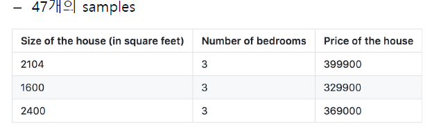
이번 포스팅은 Linear Regression 구현으로 예제는 집 크기에 따른 집 값 예측을 하는 Housing prices(Example of ndrew Ng)이다.
1. Import, data loading
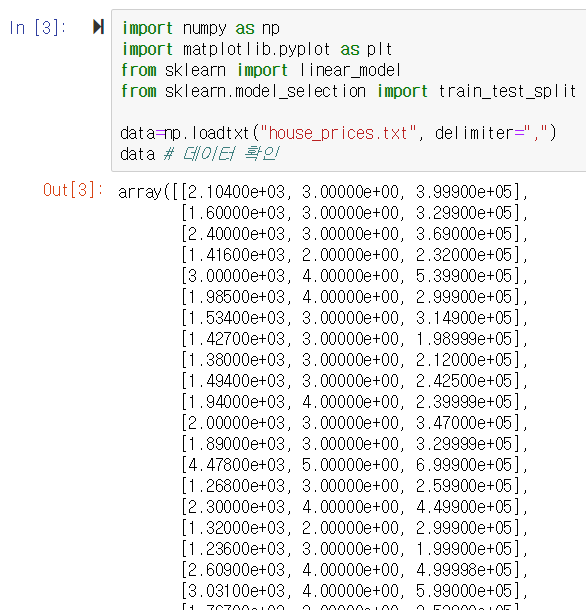
import num as np
import matplotlib.pyplot as plt
data = np.loadtxt("house_prices.txt", delimiter=",")
data #데이터 확인.
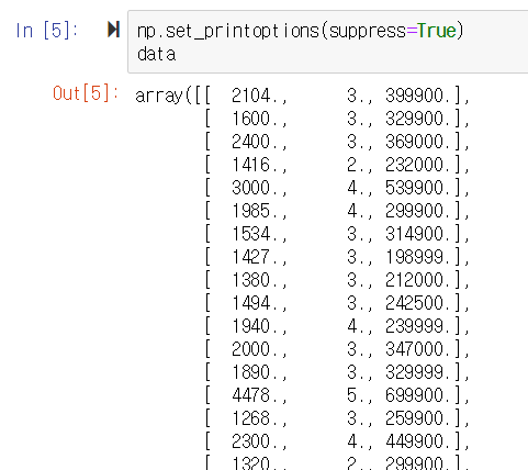
* 출력이 안예쁘다. numpy 패키지의 숫자 프린팅 옵션으로 숫자 포맷을 변경한다.
np.set_printoptions(suppress=True)
data
printoptions 함수는 아래 링크 참고.
https://docs.scipy.org/doc/numpy/reference/generated/numpy.set_printoptions.html
numpy.set_printoptions — NumPy v1.16 Manual
Scipy.org Docs NumPy v1.16 Manual NumPy Reference Routines Input and output index next previous numpy.set_printoptions numpy. set_printoptions ( precision=None , threshold=None , edgeitems=None , linewidth=None , suppress=None , nanstr=None , infstr=None , formatter=None , sign=None , floatmode=None...
docs.scipy.org
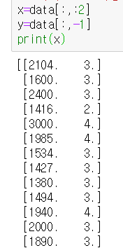
2. 데이터 셋을 X와 Y로 분리
x = data[:, :2] #모든 행 : 0, 1열
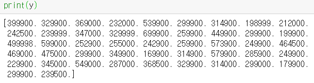
y= data[:, -1] #모든 행: 마지막 열. 이 문제에선 data[:,2]와 동일
3. 학습 데이터 및 테스트 데이터 분할
* 일부는 학습데이터에 활용하고, 일부는 학습 후 테스트 데이터로 활용함
x_train, x_test, y_train, y_test = train_test_split(x, y, test_size=0.2, random_state=4)
/*
- test_size: 테스트 데이터 비중. 여기선 값 중 20%만 테스트 값으로 하고 80%는 training data로 씀
- random_state: 랜덤으로 선택되는 데이터
random_state
:랜덤으로 선택하는 이유는 데이터가 이미 내림차순 등으로 정렬되어있을 경우 순서대로 50개를 뽑으면,
그건 랜덤학습이 아니라 이미 사람 손을 한번 탄 데이터임. 사람이 원하는 값이 나올 가능성이 높아짐.
중구난방으로 데이터를 학습시켜야 실제 예측값과 실제값이비슷하게 나올 수 있음.
*/
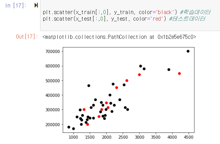
4. 학습 데이터와 테스트 데이터 plotting
plt.scatter(x_train[:,0], y_train, color='black') #학습데이터
plt.scatter(x_test[:,0], y_test, color='red') #테스트데이터
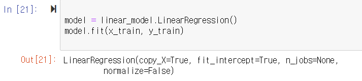
5. 선형회귀 모델 학습
model = linear_model.LinearRegression()
model.fit(x_train, y_train) #linearregression 모델에 x_train, y_train 학습
6. 테스트 데이터 넣어서 예측
result = model.predict(x_test)
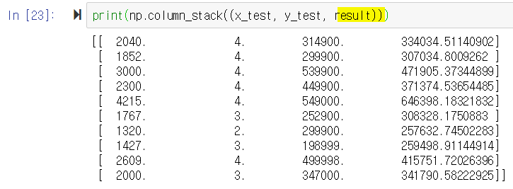
7. 실제 가격과 예측 가격 비교
print(np.column_stack((x_test, y_test, result)))
#result가 6.에서 x_test로 돌린 예측 값인데 실제 값(y_test)과 거의 비슷하게 나옴.
첫 행의 집값은 314900이나, 예측값은 334034.---- 가 나왔음.
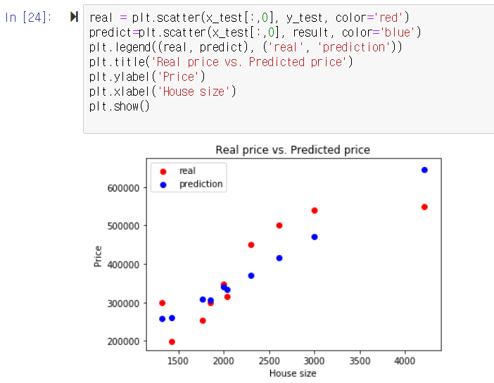
8. 그래프 제대로 그려보기
real = plt.scatter(x_test[:,0], y_test, color='red')
predict=plt.scatter(x_test[:,0], result, color='blue')
plt.legend((real, predict), ('real', 'prediction'))
plt.title('Real price vs. Predicted price')
plt.ylabel('Price')
plt.xlabel('House size')
plt.show()
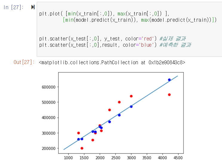
9. 학습된 선형 모델과 예측 결과 plotting
plt.plot( [min(x_train[:,0]), max(x_train[:,0]) ],
[min(model.predict(x_train)), max(model.predict(x_train))])
#선을 그려보자. min <-> max간 선을 그려줌.
plt.scatter(x_test[:,0], y_test, color='red') #실제 결과
plt.scatter(x_test[:,0], result, color='blue') #예측한 결과